Tote-Bag Design for a Travel Company

1
Created on 99designs by Vista
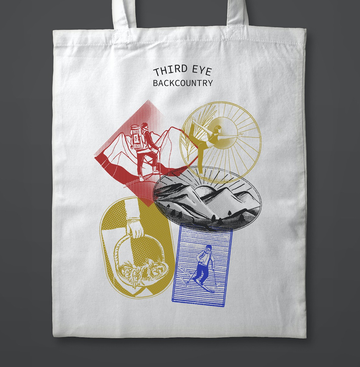
I wanted to capture key experiences that is provided by the client's company. So 5 activities were chosen and translated into a stamp-like illustration.
Using primary colors and the halftone effect, I try to achieve a 'vintage' look. It was then arranged to look like stamps you'd get on passports when travelling.