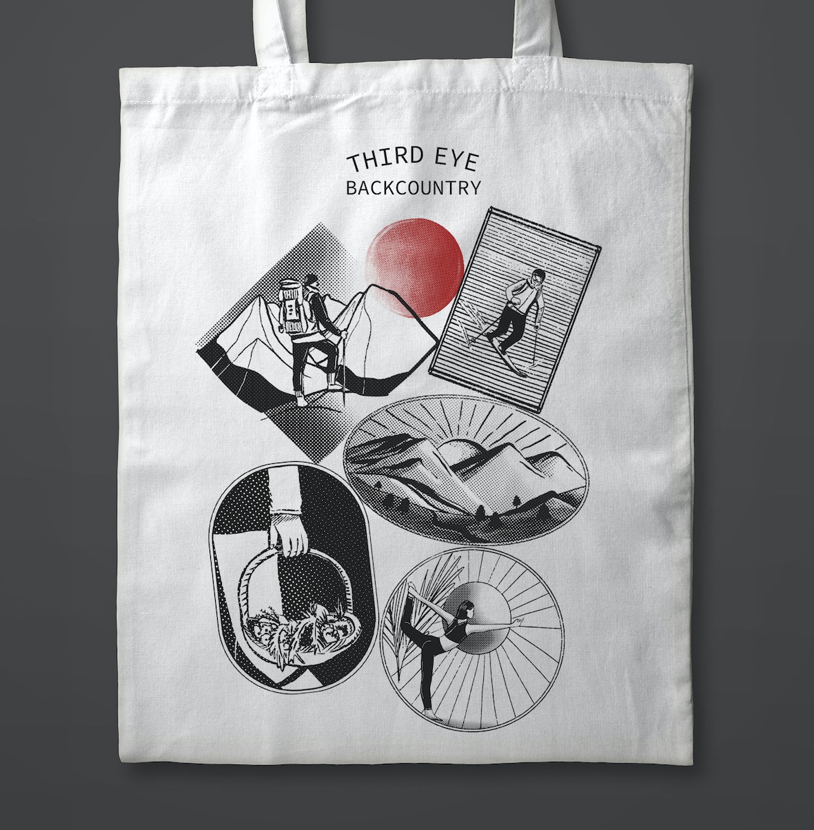
Tote Bag Design for a Travel Company (B/W Version)

1
Created on 99designs by Vista
I wanted to capture key experiences that is provided by the client's company. So 5 activities were chosen and translated into a stamp-like illustration.
Using only black & white and the halftone effect, I try to achieve a 'vintage' look. It was then arranged to look like stamps you'd get on passports when travelling.
The design is completed with a red circle as a representation of the client's logo.