
Created on 99designs by Vista
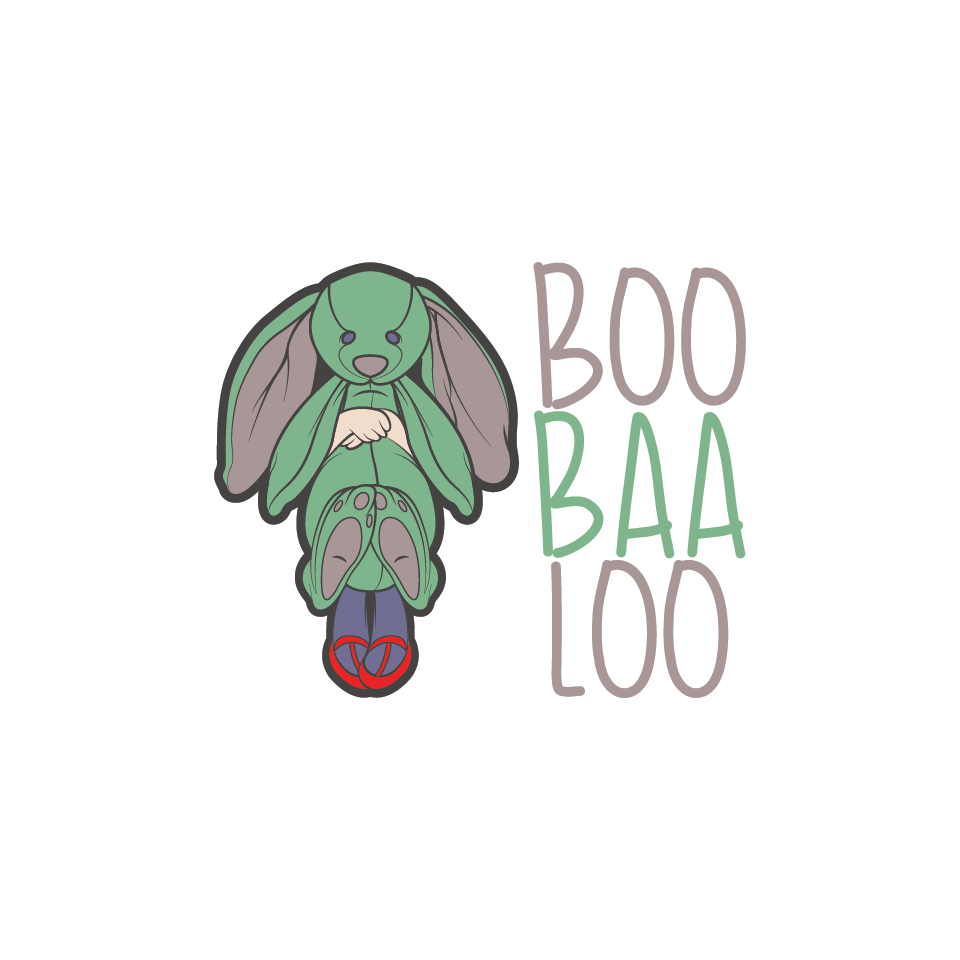
In designing and creating the BooBaaLoo logo, I tried to keep in mind and express the fun and fresh character of this company and to represent to the most its activity. Given that this brand is dedicated to kids, I kept my focus on designing a playful and full of imagination logo and thus I chose not to oversimplify the mark – the toy bunny – but try to stimulate imagination throug it (being a rather complex image, it tells a story without words), while keeping it readable at a small scale, so that it works as a visual identity in a variety of contexts. The font I used is playful, yet clean and clear and interacts here with the visual mark through color to form with it a unitary whole, making it a visual element as well.