
In this contest the aim was to create a logo for a pubs collective named "The Village People" that wants to become a point of reference for the local community and a center for activism and social change.
I tried to embed the brief in 3 main concepts:
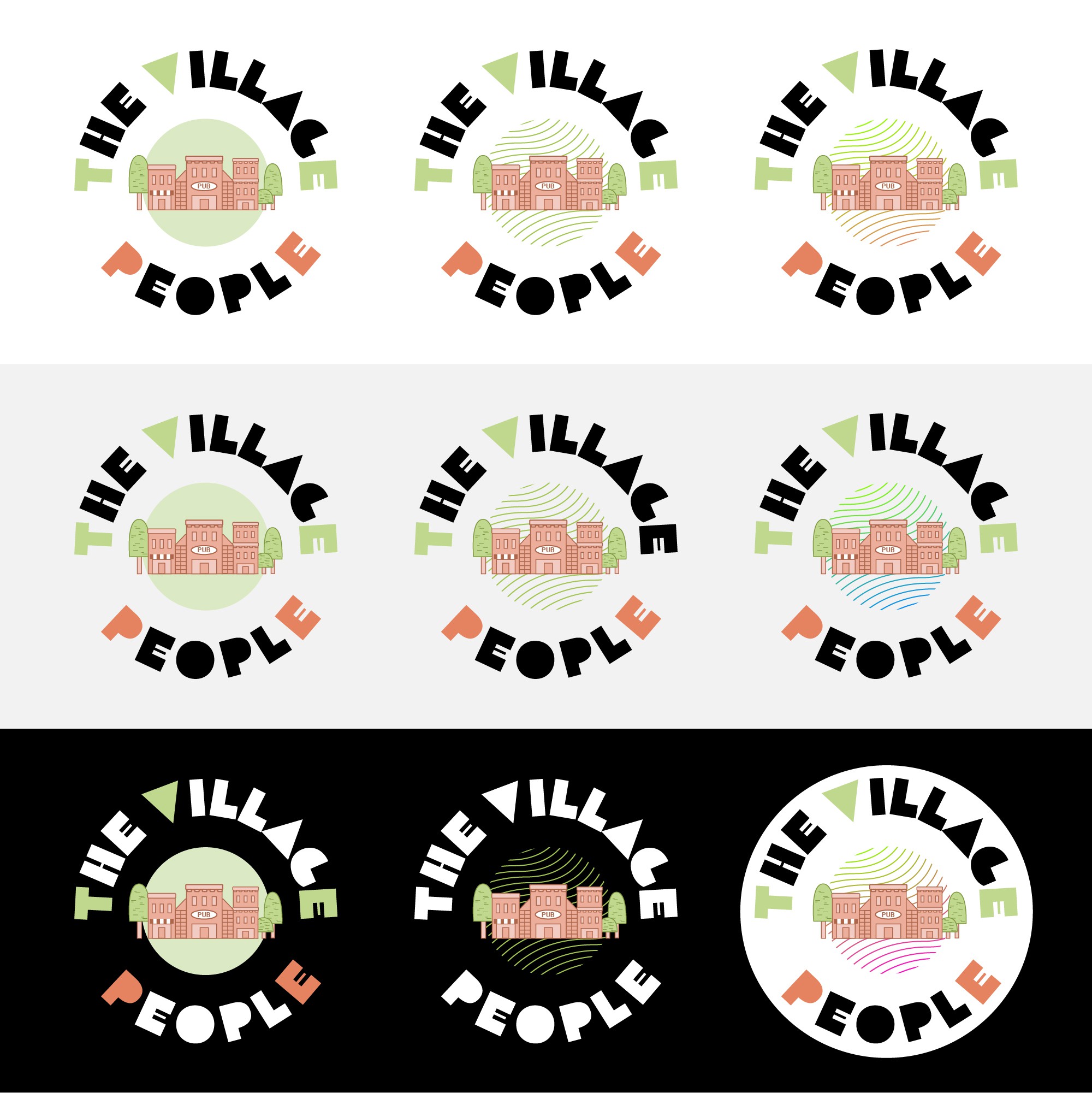
1) Sense of community: the village is in the center, becoming a point of reference for the people of the area to solve local challenges and boost positive change.
2) Circular organic shape: it conveys a sense of welcoming and openness, where everybody is equal and all the People of The Village can contribute to the greater good.
3) Since the project has the same name of the famous band I thought of using a funky font & vibrant colours B-)
I provided few different variations in order to let the client see more possibilities and let him decide his favourite one. This logo is also really suitable to be animated for social media or a website (ex. spinning).