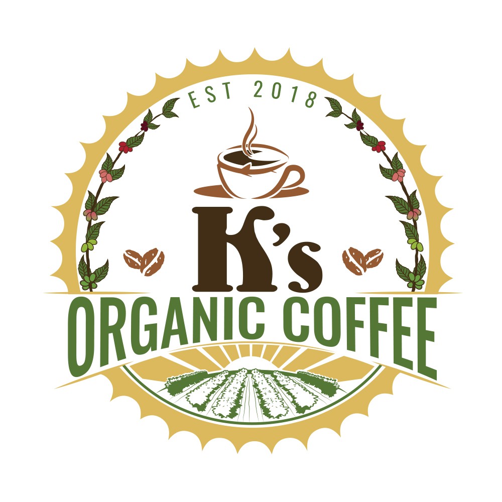
The client wanted her logo to be simple that would immediately tell what her product is all about. She wanted to have coffee plantations incorporated on her logo which means that her product is directly from local farmers. Not only does she wanted her logo to represent her products but also to support local farmers and encourage everybody to choose organic. It's the client's idea to have coffee for a border which really adds up to the logo being organic. I also made the coffee bean that looked like a heart because like what I told the client "All good things comes from the heart, and coffee is one of those good things." and knowing that it came from local farmers, it is planted with love and care. And the sun rays also represent that mornings are always the best time to have a cup of coffee. Notice also the cup of coffee? I made it to look like a coffee bean, it means that there's nothing mixed on it, it's pure coffee.
