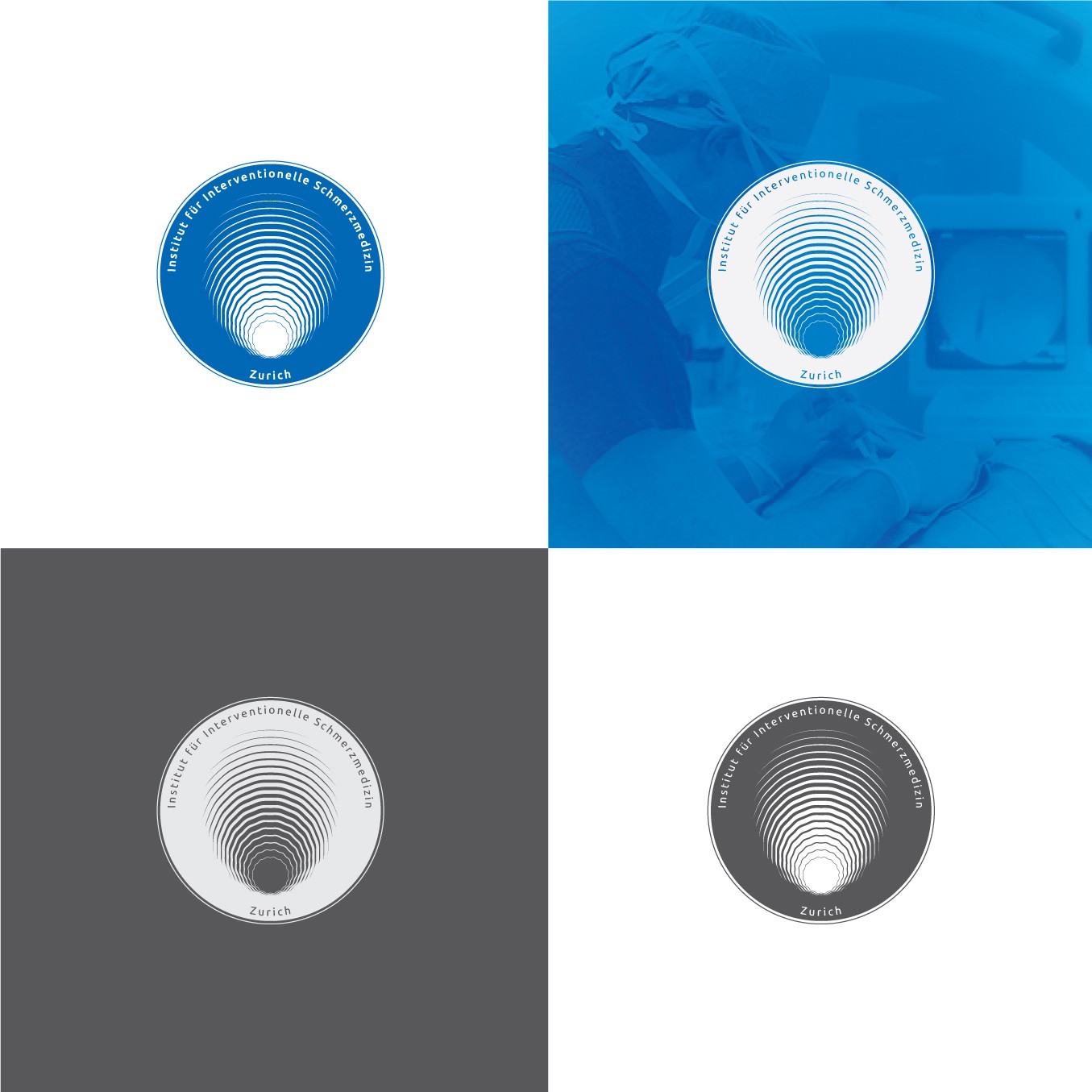
The mark created is sophisticated, neutral, economical, it is geometric and abstract, memorable, only one color is applied Blue. This color conveys Intellectuality, knowledge, technology, it soothes the eye and have a calming quality. Through the composition the eye of the consumer is drawn to the title and then the waveleght carries the sight at the location: Zurich. The typography used in the logo is clear and readable at any size or surface, it is a free font called Ubuntu. Its icon and text work together because i wanted to be like an emblem, a seal, something unique. It is enclosed in a circle shape because i want to give a sense of union, community, motivation.
Its center form tells that techniques like ultrasound, x-ray or personalized therapies are applied to reduce pain, hence the wave which periodically will reduce the chronic pain of patients. It shows like a fingerprint because you will improve lifes with the sense of touch.
