Logo Design for Sweet Stix

3
Created on 99designs by Vista
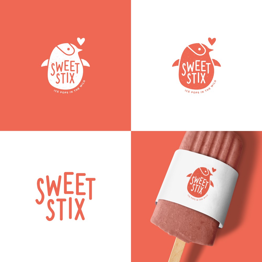
This logo design uses a more cute and friendly approach. The colour of the branding represent the brand as a very sweet and approachable brand.
The penguin silhouette is simplified into as minimal as possible, unnecessary details are removed, leaving details that signifies a penguin. It is crafted in a organic shape to represent the brand as a very raw and organic brand (popsicles are made from natural and simple ingredients)
The font of the logo is self-crafted so it is not restricted by any creative license.