
The Peek company provides yacht charter services. Target audience - married couples.
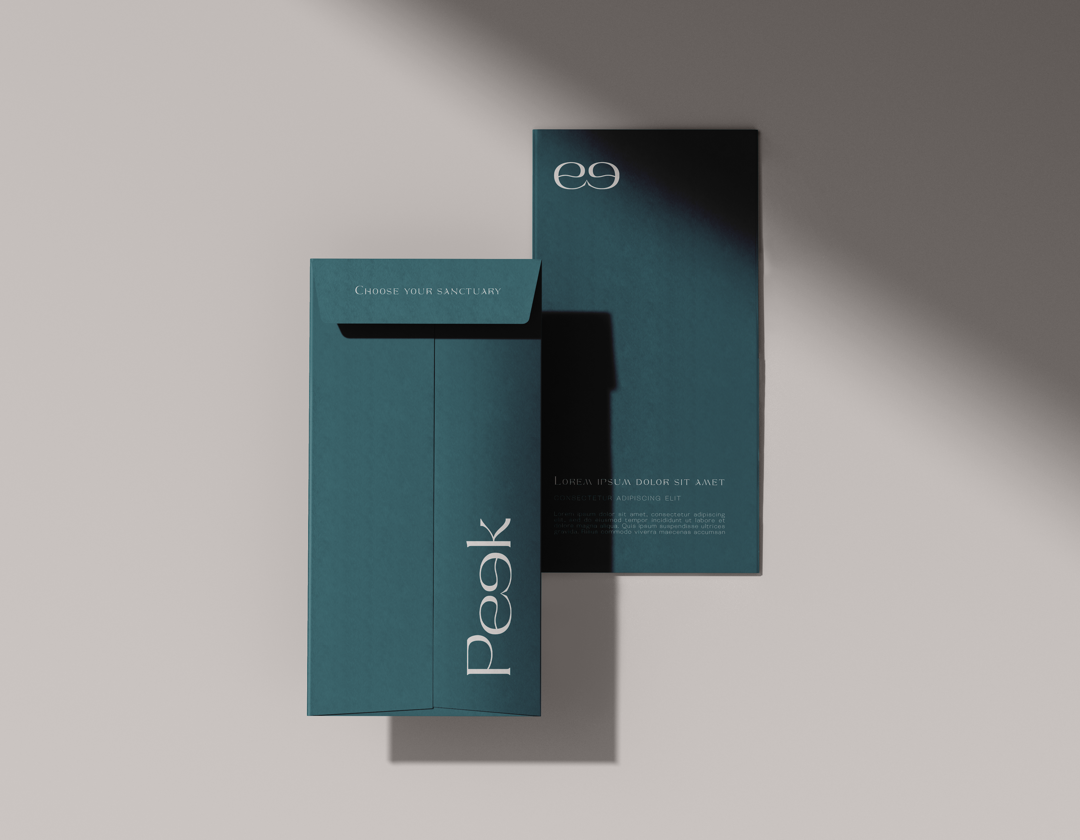
It was necessary to emphasise status and courage, combined with calmness and reliability in the image of the brand. That's why I chose a font that combines clean and strict lines with smooth curves, bringing together seriousness and ease.
I saw an opportunity to beat the brand name and add a graphic element to the logo by arranging the letters to look like binoculars.
The color in the brief was declared green, and the most logical here is the color of the sea wave, which perfectly emphasises the status of its depth.