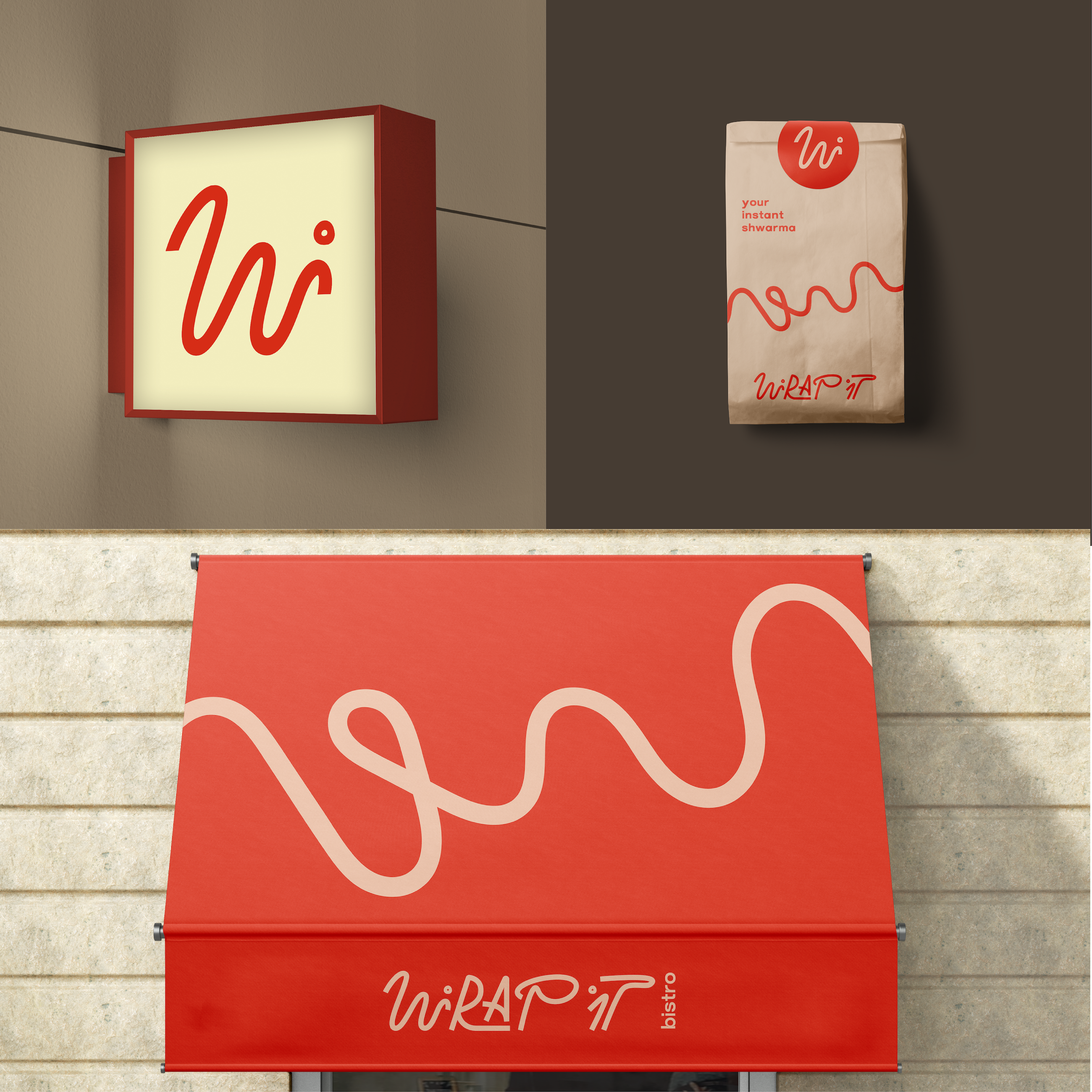

The task of the project was to create lettering that embodies the two main meanings of the brand - "rapid and funky". Slanted letters epitomise quick service.
Segmented target audience I highlighted the main characteristics: modern, dynamic, actively socialising, appreciate the opportunity to eat delicious and balanced meals at any time of the day and not spend a lot of time on it.
With the color and style of lettering I tried to convey this simplicity, friendliness and flexibility - the main ideas around which the communication between the brand and the consumer will be built.