Distinctive Logo Concept for Research Institute Hub

0
Created on 99designs by Vista
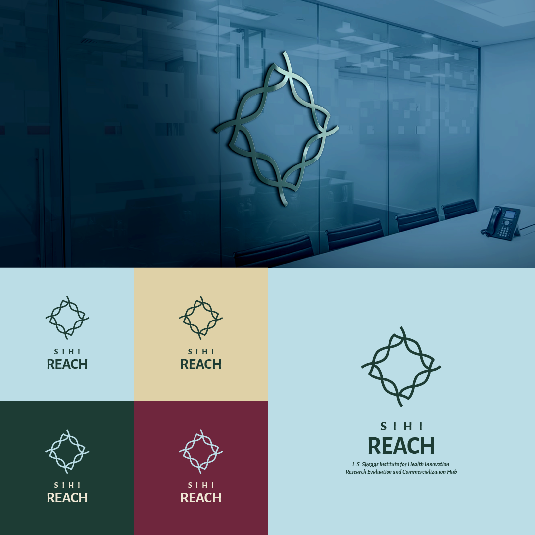
The symbol is made of 4 DNAs which intersect, creating a rhombus. I think this speaks both for the activities in the field of biomedical innovations, and for the idea of a hub - a place where people intersect.
From a design point of view, the logo is balanced and symmetrical, which is another plus.
On the bottom left corner, you can find more color variations which suit the project and have good contrast. Of course, the colors are also aligned with the brand guidelines.
On the bottom right corner, you can find a version which contains the full name for the situations where the brand needs it.
And to envision how this would come to life, I included an application on top of it all.