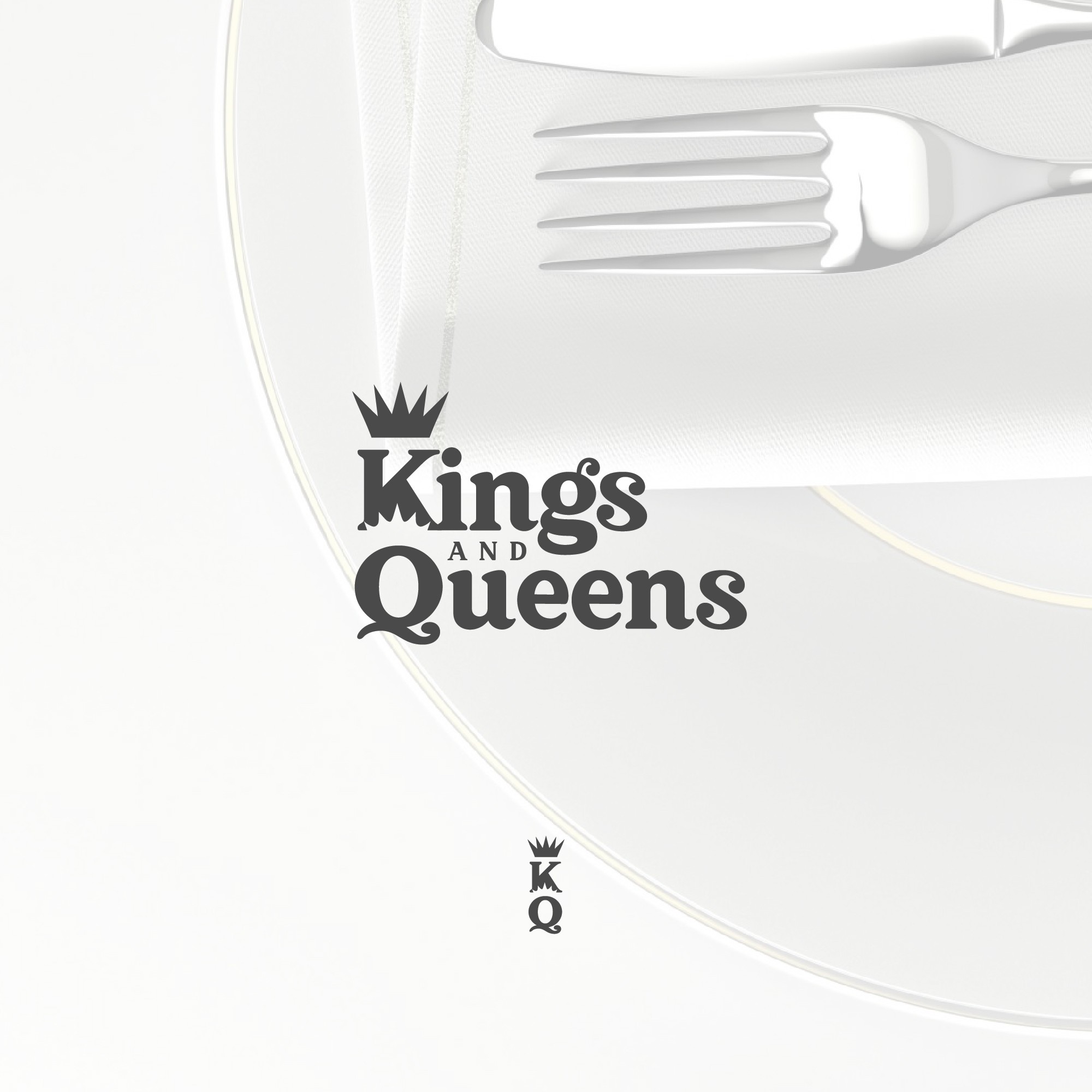

Vanderleeden and their team sell high-end cutlery to females between 26 and 38. They stated on their contest brief that the logo needs to work both an icon and a full logo as the name of the brand. They wanted a mature, feminine, sophisticated, and luxurious approach.
So I was thinking on how I could make a logo that would be clean, and easily recognizable but still feels luxurious. I also keep in mind that the logo should also work horizontally for cutleries therefore I took the time focusing on the logo mark (the icon alone) that if paired with the full logo shows no clutter. Thus, I wrote some informations and drafted some king and queen crowns, letterings, and different variations of the logo on a paper and pen until I came up with this logo that fits their requirements.