
Created on 99designs by Vista
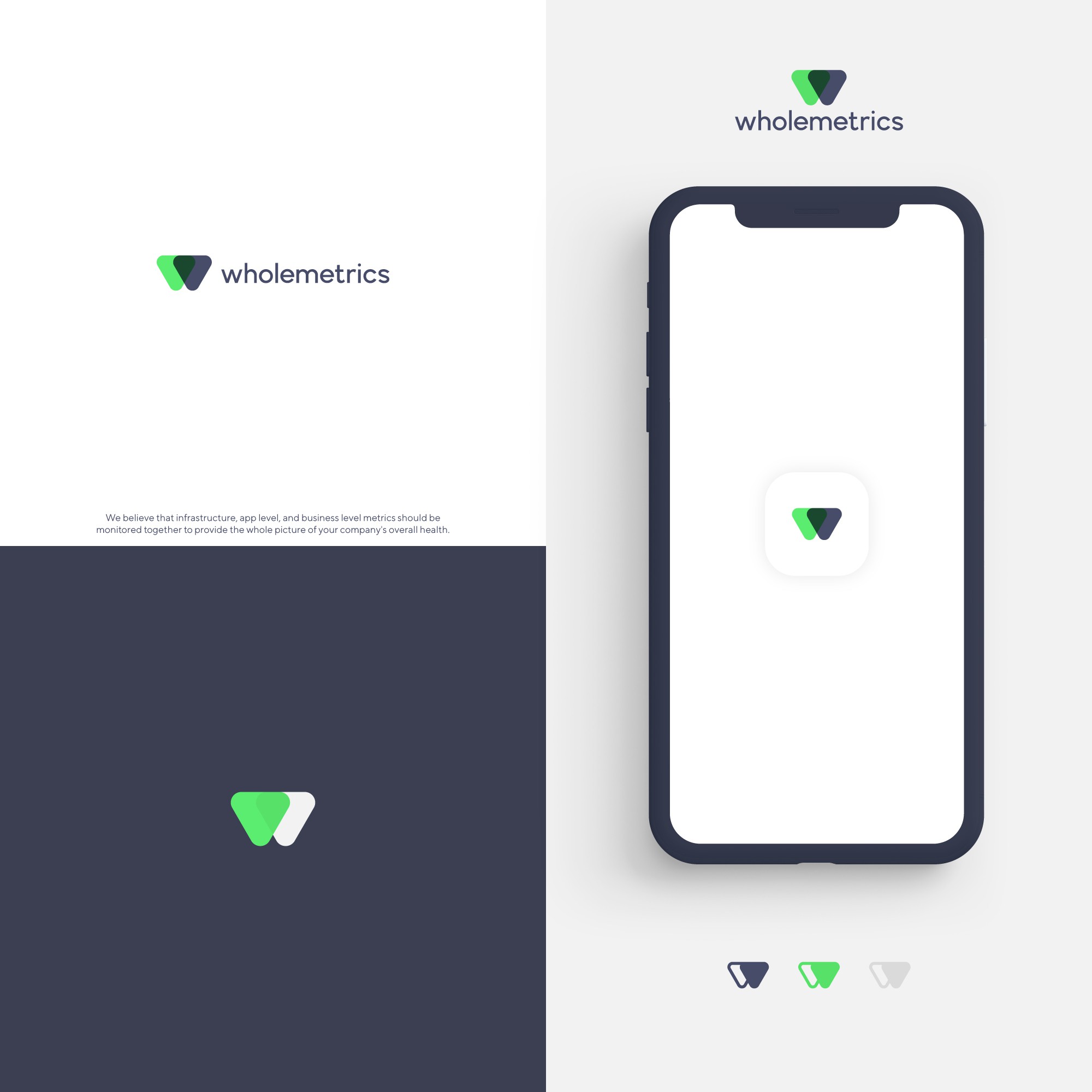
Simplifying the letter and making it pop was the first step in this process. So, I reduced the W to its essentials and subtly incorporated a reference to a wave graph representation.
This clever color palette make the brand pop even more and confers to it a youthful vibe without losing its professional appeal.