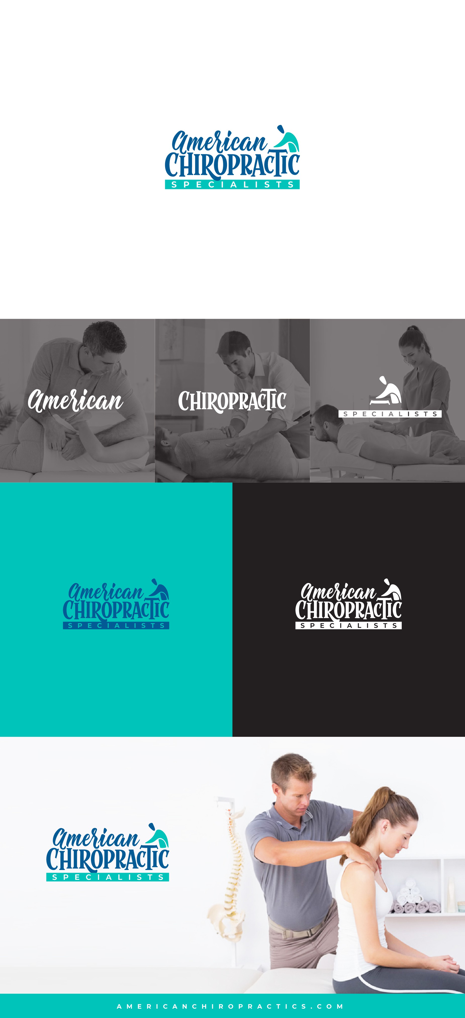

As the contest evolved, the "Chiropractic" statement has to be the funnier and more vivid. So I decided to just use the font of my first proposal and then focus on the "American" and "Specialists" part as individuals to try to enhance the middle word. In this case, as my fellow contestants did, using size contrasts.
For the first statement, using a cursive font with old american style was my choice, because as it has the hand-made feeling and it's easier to relate to something more personal.
Then I made an humanoid shape that represents a chiropractor on the side, working on his table.
Finally, I used color pairings between them to help to make the message clearer. Notice that the "American" and the head of the shape share the same blueish shade (both related to human persons), and the "Specialists" box uses the same morphology and color than the shape's body (also resembling to the suit, giving them the professional touch)
Even if I didn't win, the process was fun enough!