Timeless Logo Desin for an Events Company

0
Created on 99designs by Vista
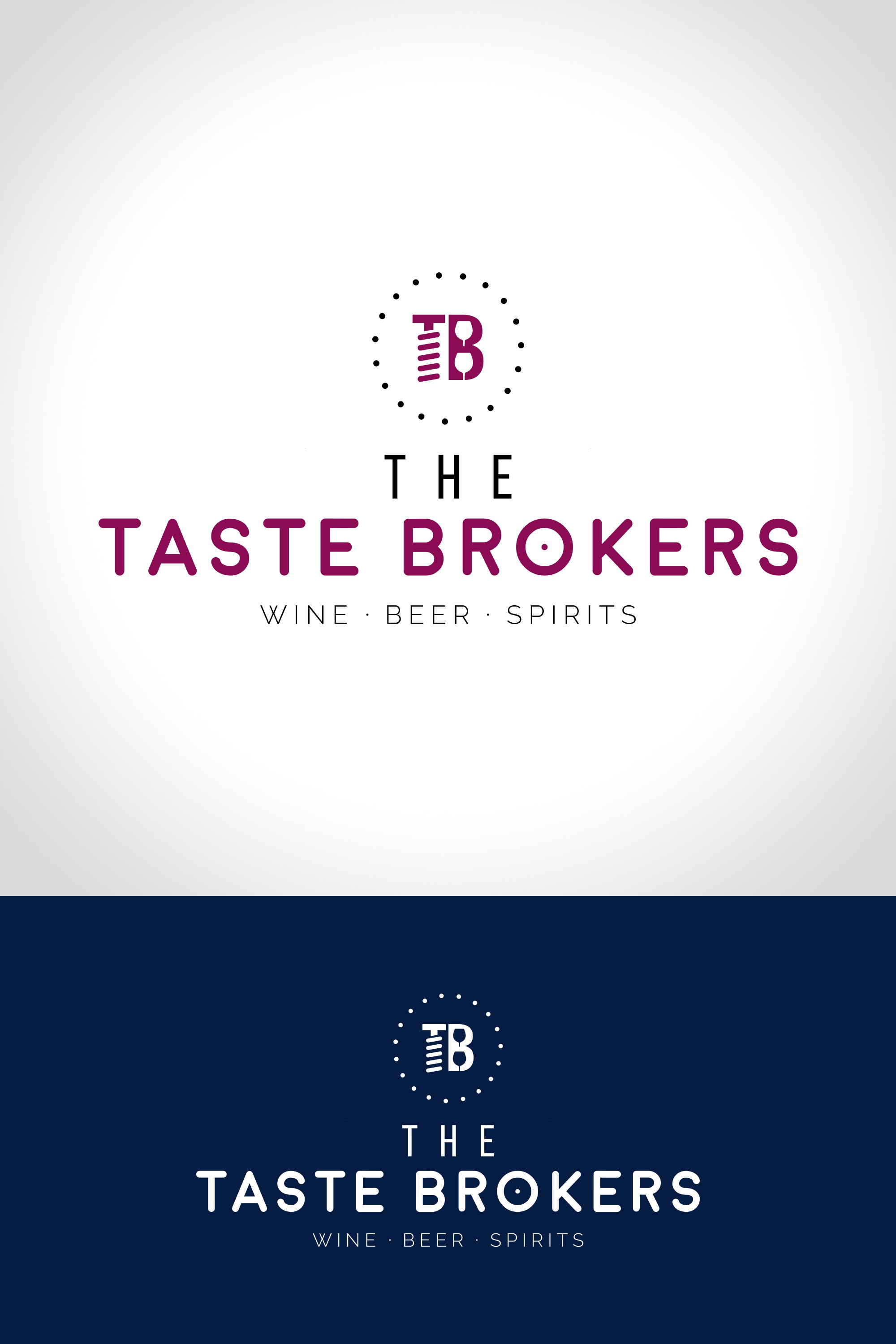
With the company being a wine and other alcohol-tasting events company, I turned the 'T' into a corkscrew and added wine glasses into the negative space of the 'B.' The idea was to keep the design clean and exude a sense of quality.