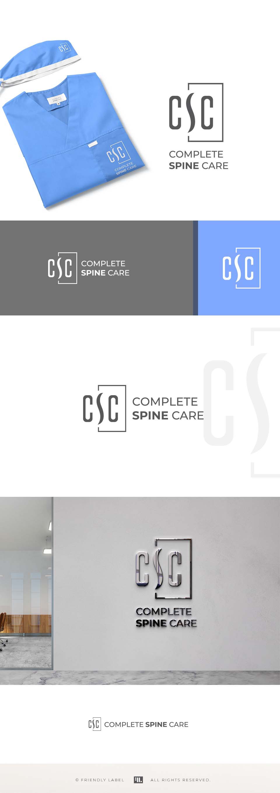

A modern, minimalist and smart logo for a great spine surgeon.
The "S" ( with a shape that reference a spine) is the visual focus of the icon, not the Cs. Although all the 3 letters are important in the visual economy, the S is slightly emphasized due to its shape and the rectangular framing.
The messages that the logo sends out are: professional, top expertise, trustworthy, serious, honest, exceptional, straight-forward, transparent.
The 2 brand colors that I featured here is a serious, but soft and elegant gray and a calming, relaxing light blue.
The typography is a modern, minimal and clean sans serif that has a perfect compatibility with the sophisticated simplicity of the icon.
Let’s connect and explore how we can elevate and energize your brand—through logo design, branding, web design, social media graphics, ads, and more.