
My logo has been designed according to the indie philosophy.
Starting with a low budget, the indie developers can’t count on a next-gen graphic for their games, so important nowadays.
For this reason, the way to achieve a well-done videogame is: a good idea, innovative mechanicals and ability to engage users.
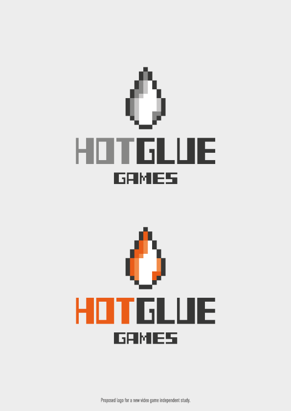
In detail, the logo i thought about consists of two elements, the shape of a red (hot) drop of glue and the brand name.
In brief, there aren’t many informations about the company "Hot Glue" (history, values, ideas,…), so for the icon i based my idea only on the brand name.
It’s important to remember that the drop and the name are made using pixels and crayon-vintage colors.
Pixel bring to mind vintage video games, but is also linked to the concept of simplicity and essentiality.
“Even with few resources, we can create fantastic worlds”.