Logo Design for Exterior Cleaning and Restoration Company

9
Created on 99designs by Vista
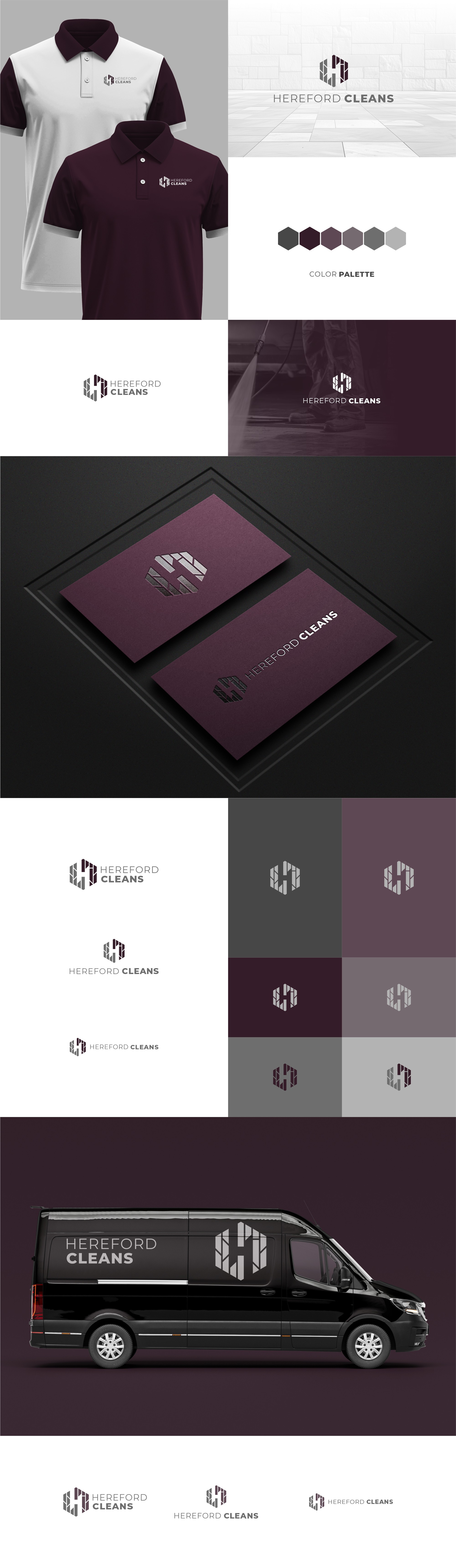
The logo for Hereford Cleans is built around a hexagonal shape, symbolizing precision and attention to detail—key attributes of the company’s cleaning services. The hexagon, often associated with efficiency and structural strength in nature, reflects the company’s reliable and meticulous approach to exterior cleaning.
At the center of the design is the letter 'H,' representing Hereford Cleans, while incorporating the client’s original pattern for a personal and distinctive touch. The clean, sharp lines emphasize professionalism and accuracy, aligning with the company’s commitment to high-quality cleaning for driveways, patios, decking, and building exteriors.